Cleanliness You Can Feel
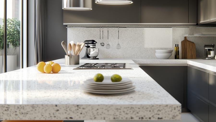
There’s a reason certain kitchens feel spotless even when a rogue breadcrumb is clearly planning an uprising. Pale counters—whites, soft grays, muted creams—give the mind a reassuring sense of order. They highlight dirt instantly, which can be stressful for some people but wildly satisfying for others who find peace in catching every crumb like they’re in an ongoing domestic espionage thriller.On the other end of the spectrum, darker surfaces offer a more forgiving visual field. They conceal imperfections to the point where you may forget the flour explosion of last Tuesday ever happened. This can be liberating or mildly dangerous, depending on how often you use your kitchen as a laboratory. Still, many homeowners appreciate how deeper hues dial down visual noise and invite a calmer, more grounded cooking environment.
Appetite Games
Color has a notorious influence on eating habits. You might not think your countertop is plotting your snack schedule, but here we are. Warm tones—terracotta, muted yellows, soft peaches—have a subtle but measurable way of nudging appetite upward. Something about them whispers, “Yes, have another.” It’s not quite peer pressure, but it’s close.Cooler shades, like icy blues and gentle greens, tend to settle the senses. They create an atmosphere where meals feel intentional rather than impulsive. There’s a gentle psychological brake applied to your cravings, as if the countertop is quietly patting your shoulder and advising moderation. This makes such hues appealing for anyone trying to balance culinary indulgence with, say, the ability to still fit into their jeans after the holidays.
Textures Doing Secret Work
Even the smoothest surface has a personality. Glossy finishes bounce light around, making kitchens feel bright and energized. This can be motivating when you need to prepare dinner after a long day, though it may also showcase fingerprints with the enthusiasm of a crime drama.Matte surfaces mellow everything out. They diffuse reflections and create a soft, composed mood—as if the countertop is wearing a well-tailored suit and politely refusing to draw attention. For people sensitive to visual clutter or harsh lighting, matte textures offer a small but meaningful sense of reprieve.
Choosing a Palette That Works With Your Mind
Selecting the right countertop color isn’t just about matching cabinets or impressing guests who pretend not to judge your renovation choices. It involves tuning into how you want to feel while navigating daily kitchen rituals. Do you want to feel sharp and focused during meal prep? Lighter hues, with their clarity and bright presence, can encourage a sense of precision—ideal if you frequently attempt recipes that include phrases like “whisk aggressively.”If comfort is the priority, earthy mid-tones strike a stable emotional chord. They neither shout nor whisper but offer the kind of steady, reliable mood that makes even complicated meals feel manageable. These tones play beautifully with natural light and pair well with wood grains, stone accents, and the general desire to maintain sanity while cooking.
For those who crave creative energy, bolder shades can stir motivation without overwhelming the space. Deep greens, charcoal blues, or subtle maroons build visual interest that keeps the kitchen from feeling predictable. They signal intention and can even make your cookware look more dramatic, which is a perfectly legitimate goal in life.
Small Adjustments With Big Impact
While countertop color holds center stage, pairing it with thoughtful supporting elements enhances the psychological effect. If you’re experimenting with mood and function, consider these practical combinations:- Warm counters with cool lighting to soften the appetite boost.
- Dark counters with warm metallic accents to add balance and keep the room from feeling heavy.
- Light counters with boldly patterned backsplashes to maintain brightness while adding personality.
- Matte textures paired with glossy appliances to create contrast that keeps the eye engaged.
Counter Intelligence
In the end, countertop colors are quiet mood engineers, shaping daily routines in ways most people never consciously notice. They can energize or relax, tempt or temper, reveal or conceal. By choosing hues and textures that align with your emotional rhythms, you turn the kitchen into a place that supports your habits rather than wrestles with them.A well-chosen surface isn’t simply decoration. It’s a subtle partner in your culinary life—an ally during frantic mornings, slow Sunday afternoons, and every moment when you’re trying to decide whether chopping vegetables counts as meditation. When the color beneath your cutting board works in harmony with your headspace, even the most ordinary meal preparation becomes a little easier, a little calmer, and occasionally, delightfully amusing.
Article kindly provided by kitchenrenovationlondon.co.uk